
Industrial color palettes have greatly shaped modern aesthetics across various design fields. You'll find their influence in interior spaces, fashion, and digital interfaces. These palettes, characterized by muted earth tones, grays, and weathered hues, emerged from practical needs in industrial settings but have evolved into versatile design elements. They evoke feelings of reliability and strength while promoting sustainability through durability and energy efficiency. As designers blend industrial colors with other styles, they create unique aesthetics that resonate globally. The future of industrial palettes looks promising, with technological advancements and cultural influences driving innovative color applications. Exploring this aesthetic further reveals its profound impact on contemporary design.
Origins of Industrial Color Palettes
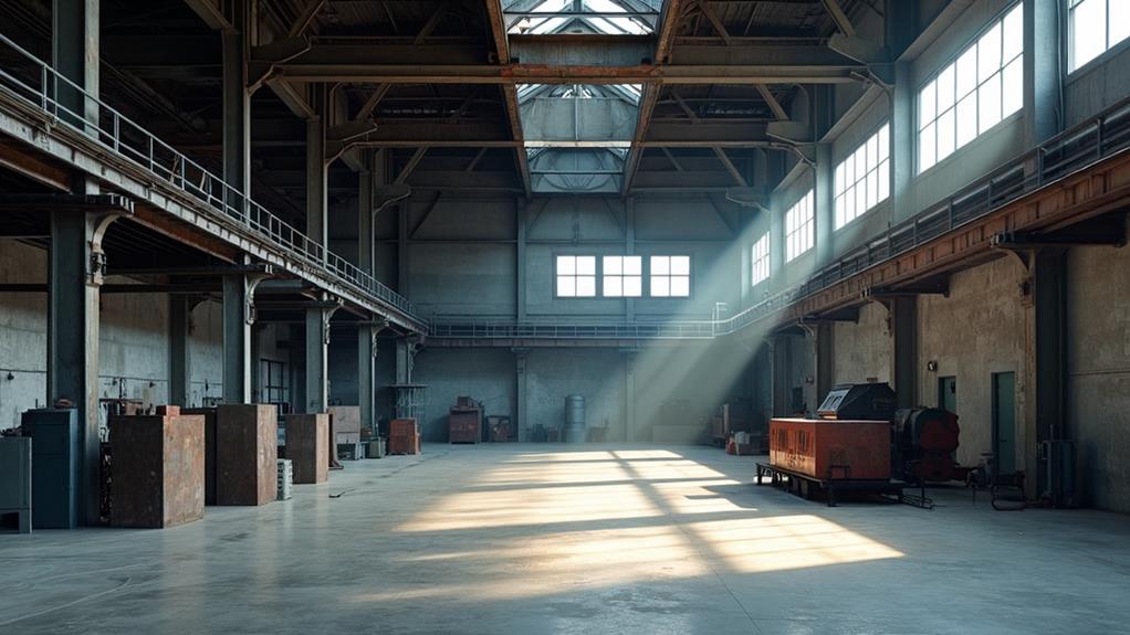
The origins of industrial color palettes can be traced back to the late 19th and early 20th centuries, during the height of the Industrial Revolution. As factories and manufacturing facilities proliferated, a new aesthetic emerged, driven by functionality and efficiency.
You'll find that these early industrial spaces were characterized by muted, earthy tones that served practical purposes. The incorporation of raw materials like exposed brick and concrete further influenced the color palette, adding texture and depth to industrial environments.
Colors like steel gray, rust brown, and machine green weren't chosen for their visual appeal but for their ability to hide dirt, grease, and wear. These hues also reflected the materials commonly used in industrial settings: metal, brick, and concrete.
The palette expanded to include safety colors, such as bright yellows and reds, which were used to mark hazardous areas and equipment.
As you examine the evolution of industrial color schemes, you'll notice that they've been influenced by technological advancements and changing workplace regulations. The introduction of artificial lighting, for instance, led to the use of lighter colors to enhance visibility.
Over time, these utilitarian color choices became associated with industrial aesthetics, influencing design trends beyond the factory floor and into modern architecture, fashion, and graphic design.
Key Characteristics of Industrial Hues
Industrial hues possess distinct characteristics that set them apart from other color palettes. You'll notice these colors are often muted, desaturated, and have a certain grittiness to them. They're inspired by the raw materials and machinery of factories, warehouses, and urban environments.
The primary colors in an industrial palette typically include shades of gray, ranging from light concrete tones to deep charcoal. You'll also find earthy browns, reminiscent of rust and aged metal. Accents often come in the form of oxidized greens, weathered blues, and occasional pops of safety yellow or red.
Texture plays a significant role in industrial hues. They're designed to evoke the feel of rough concrete, weathered wood, or corroded metal. This gives them a tactile quality, even when used in digital designs.
Industrial colors are rarely pure or bright. Instead, they're often toned down with a touch of gray or brown, creating a cohesive and sophisticated look. This subtlety allows them to work well together in various combinations, offering versatility in design applications while maintaining a strong connection to their industrial roots.
Industrial Palettes in Interior Design
With the rise of urban living and a growing appreciation for raw aesthetics, industrial color palettes have found a prominent place in modern interior design. You'll often see spaces incorporating shades of gray, rust, and muted blues reminiscent of factories and warehouses. These colors create a sense of authenticity and ruggedness that appeals to those seeking a break from overly polished interiors.
When implementing industrial palettes, you'll notice designers favoring exposed materials like concrete, metal, and reclaimed wood. They'll pair these with accent colors such as deep reds or oxidized greens to add depth and interest. The key is to balance cool tones with warmer hues to prevent the space from feeling too stark or uninviting.
You'll find that industrial color schemes work particularly well in loft apartments, open-plan offices, and contemporary homes. They're often complemented by minimal furnishings and statement lighting fixtures that echo the industrial theme.
Fashion's Embrace of Utilitarian Colors
Fashion designers have increasingly turned to utilitarian color palettes, mirroring the industrial aesthetic's influence in interior design. You'll notice this trend in the prevalence of muted tones, earth hues, and monochromatic schemes on runways and in streetwear. Colors like slate gray, rust orange, and olive green have become staples in many collections, reflecting the raw materials and textures found in industrial spaces.
This shift towards utilitarian colors isn't just about aesthetics; it's a response to changing consumer values. You're seeing a growing appreciation for functionality and durability in fashion, with these colors symbolizing practicality and resilience. Designers are incorporating workwear-inspired elements, using colors traditionally associated with uniforms and protective gear.
The industrial palette's versatility allows for easy mixing and matching, appealing to consumers seeking adaptable wardrobes. You'll find these colors in everything from high-end luxury pieces to fast fashion, demonstrating their wide-ranging appeal.
This trend also aligns with sustainable fashion practices, as these subdued hues are often achieved through less chemical-intensive dyeing processes. By embracing utilitarian colors, fashion isn't only adopting an aesthetic but also reflecting broader societal shifts towards practicality and sustainability.
Digital Media and Industrial Aesthetics
Across digital platforms, the industrial aesthetic has found a new canvas for expression and evolution. You'll notice this trend in UI design, where muted grays, deep blues, and stark whites dominate interfaces, mimicking the coolness of factory floors.
Social media platforms have embraced this palette, with Instagram's shift from skeuomorphic designs to a more streamlined, industrial-inspired look.
In digital art and graphic design, you'll see the rise of brutalist web design, characterized by raw, exposed elements and a color scheme that echoes industrial environments. This aesthetic has permeated digital marketing, where brands leverage these colors to convey reliability, strength, and modernity.
Video games, too, have adopted industrial palettes, particularly in dystopian or sci-fi genres. You'll encounter games where desaturated hues and metallic tones create immersive, gritty atmospheres.
Even in mobile app design, you'll find that minimalist, industrial-inspired color schemes are favored for their clarity and functionality.
This digital embrace of industrial aesthetics isn't just visual; it's conceptual. It reflects our increasingly technologized world, where the lines between digital and physical spaces blur, and the industrial palette serves as a familiar, grounding element in our virtual experiences.
Psychological Impact of Industrial Tones
In light of the widespread adoption of industrial color palettes, it's vital to examine their psychological impact on viewers and users. These color schemes, often characterized by muted grays, deep blues, and rusty oranges, evoke specific emotional responses and mental associations.
You'll find that industrial tones can create a sense of reliability and strength, reflecting the durability of machinery and infrastructure. The cooler hues, like steel grays and navy blues, often instill a feeling of professionalism and efficiency. Conversely, warmer industrial tones like copper and bronze can add a touch of warmth and approachability to otherwise stark environments.
However, prolonged exposure to these palettes may lead to feelings of detachment or coldness. You might experience a decreased sense of creativity or emotional connection in spaces dominated by industrial colors. It's important to balance these tones with elements that soften their impact, such as natural materials or pops of vibrant color.
Understanding these psychological effects allows you to harness the power of industrial color palettes effectively. By strategically implementing these tones, you can create environments that promote desired emotional responses and behavioral outcomes, whether in digital interfaces, architectural spaces, or product design.
Sustainability and Industrial Color Schemes
How can industrial color schemes contribute to sustainability in design and architecture? The answer lies in their inherent connection to durability and longevity. Industrial colors, often muted and neutral, tend to age gracefully and remain visually appealing over time. This characteristic reduces the need for frequent repainting or redecorating, ultimately conserving resources and minimizing waste.
You'll find that these color palettes often incorporate earth tones and natural hues, which can help buildings blend seamlessly with their surroundings. This integration promotes a harmonious relationship between built environments and nature, potentially reducing the urban heat island effect and supporting biodiversity.
Additionally, industrial colors can enhance the perceived thermal comfort of spaces, potentially reducing energy consumption for heating and cooling.
When you're selecting materials, industrial color schemes often favor raw, unfinished surfaces that require less processing and fewer chemical treatments. This approach not only reduces the environmental impact of manufacturing but also improves indoor air quality by minimizing off-gassing.
Moreover, these colors can highlight the use of recycled or upcycled materials, promoting a circular economy in design and construction.
Blending Industrial With Other Styles
Industrial color palettes offer a versatile foundation for blending with other design styles, creating unique and dynamic aesthetics.
You'll find that these palettes, characterized by muted tones, raw materials, and metallic hues, can seamlessly integrate with various design approaches.
When combining industrial colors with minimalism, you're emphasizing simplicity and functionality. The stark contrasts of industrial palettes complement minimalism's clean lines and uncluttered spaces.
For a softer approach, blend industrial tones with Scandinavian design. The warmth of natural wood and light fabrics can balance the coolness of industrial colors, resulting in a cozy yet modern ambiance.
Pairing industrial palettes with mid-century modern aesthetics creates a fascinating juxtaposition. The vibrant colors and organic shapes of mid-century design provide an interesting contrast to industrial's subdued tones.
For a more eclectic look, mix industrial colors with bohemian elements. The rich textures and patterns of boho style can soften the hard edges of industrial aesthetics.
You can also incorporate industrial colors into traditional designs, adding a contemporary twist to classic interiors. This blend creates a sophisticated, timeless look that bridges past and present.
Global Influence on Design Trends
Globalization's impact on industrial color palettes has led to a rich tapestry of design influences from around the world. You'll notice that designers are increasingly drawing inspiration from diverse cultures, incorporating unique hues and textures into their industrial-inspired creations. For instance, the earthy reds of Moroccan clay, the deep blues of Japanese indigo, and the vibrant yellows of Indian turmeric are now finding their way into modern industrial designs.
As you explore global design trends, you'll observe that the austere grays and blacks traditionally associated with industrial aesthetics are being complemented by colors that reflect regional identities. Scandinavian minimalism has introduced muted pastels, while Latin American influences have brought in bold, saturated tones. This cross-pollination of ideas has resulted in a more nuanced and sophisticated approach to industrial color palettes.
You'll also find that global environmental concerns are influencing color choices. Eco-friendly design trends have popularized natural, organic hues that evoke sustainability and mindfulness. These colors are often paired with industrial materials like metal and concrete, creating a compelling juxtaposition between the natural and the manufactured.
Future of Industrial Color Palettes
As we look ahead, the future of industrial color palettes promises to be both innovative and responsive to societal shifts.
You'll see a convergence of technology and sustainability driving these changes. Smart materials that can change color based on environmental factors or user preferences will become more prevalent, allowing for dynamic and adaptive industrial spaces.
Sustainability will play an essential role, with eco-friendly pigments and manufacturing processes taking center stage.
You'll notice a shift towards colors that evoke nature and well-being, as the line between industrial and residential aesthetics continues to blur. Biophilic design principles will influence color choices, incorporating more greens, blues, and earthy tones.
The rise of virtual and augmented reality will also impact industrial color palettes.
You'll need to reflect on how colors translate across digital platforms and physical spaces, ensuring consistency in brand identity. Additionally, cultural diversity and inclusivity will shape future palettes, with a broader range of hues representing global influences.
As automation and AI become more integrated into industrial settings, you'll see color schemes that enhance human-machine interactions, focusing on clarity and cognitive ease.