
Colors such as red, dark brown, and black are generally not ideal for bedroom environments due to their psychological implications. Red is known to increase blood pressure and heart rate, leading to feelings of agitation. Dark brown can create a gloomy atmosphere, making spaces feel heavier and less inviting. Black, while sophisticated, often induces feelings of claustrophobia, especially in smaller rooms, and can diminish natural light. Additionally, dark purple may stimulate vivid dreams but can overwhelm individuals seeking tranquility. Understanding the effects of color is essential for creating a relaxing environment that promotes restful sleep and well-being. Further insights on color usage can enhance your choices.
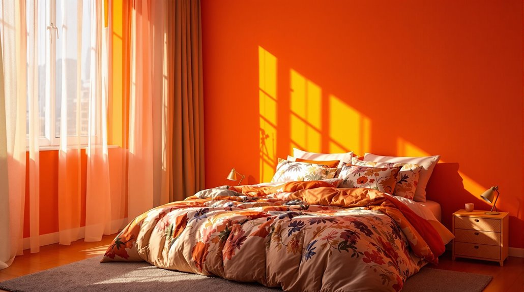
Red: The Aggressive Hue
While many colors can influence the atmosphere of a space, red stands out as particularly problematic for bedrooms due to its aggressive hue. This color is known to raise blood pressure and increase both heartbeat and muscle movement, often triggering feelings of agitation and unrest. Red is associated with intense emotions, including fear and anger, making it unsuitable for a restful environment. It is considered the worst color for bedrooms, as its stimulating nature interferes with relaxation and sleep quality. Additionally, red can create an illusion of smaller space, further contributing to discomfort. In contrast, cooler colors like blue and green are recommended for bedrooms due to their calming effects, promoting serenity and better sleep.
Dark Purple: Vivid Dreams
How does dark purple influence the quality of sleep and the nature of dreams? Dark purple, while creating a dramatic and romantic atmosphere, can disrupt sleep by fostering vivid dreams and heightened dream recall. The color's intensity might overwhelm individuals who prefer lighter environments, potentially leading to sleep disturbances. Additionally, the moody backdrop of deep purples can stimulate deeper thought, further affecting sleep quality. Vivid dreams, which may reflect unresolved emotions, can be exacerbated in such a color scheme. Although dark purple can offer coziness, achieving balance through complementary colors and soft lighting is essential to mitigate its overwhelming nature. Ultimately, the psychological effects of dark purple may vary widely among individuals, influencing their sleep experience distinctly.
Dark Brown: Gloomy Atmosphere
A sense of heaviness often permeates rooms adorned in dark brown, as this color can create a gloomy atmosphere that feels oppressive, particularly in smaller spaces. While dark brown tones can balance natural light, they often make the area feel enclosed and less airy. Regarding sleep environment, dark brown may hinder the creation of a calming atmosphere, potentially evoking feelings of isolation if not paired with lighter accents. Careful consideration is necessary when incorporating this color, as it requires ample lighting and the use of neutral or lighter elements to mitigate the heavy effect. Ultimately, the choice of dark brown should reflect the desired aesthetic and accommodate the room's dimensions for ideal balance.
Black: Depressive Effects
The allure of black in bedroom design often masks its potential for depressive effects. While this color can create a cozy and intimate atmosphere, it may also induce feelings of claustrophobia, particularly in smaller spaces. Black is associated with sophistication and drama; however, excessive use can become overwhelming. Its light-absorbing nature can exacerbate dim conditions, making even large rooms feel confined. Although black offers a sense of stability and security, it can feel stifling to some individuals. To mitigate these effects, incorporating black as an accent rather than the primary color and balancing it with natural light sources can enhance the overall ambiance, fostering a more inviting environment conducive to relaxation and well-being.
Bright Purple: Overstimulation Risks
Bright purple, while striking and bold, presents significant risks of overstimulation in bedroom environments. This vibrant hue can disrupt the peaceful atmosphere necessary for relaxation, often triggering feelings of frustration or sadness. The emotional impact of bright purple varies, with lighter shades recommended for a more soothing effect. Excessive use of this color can overwhelm the senses, especially when combined with other strong colors. To mitigate overstimulation, it is advisable to incorporate bright purple as an accent, alongside neutrals or lighter shades. Additionally, utilizing color blocking techniques and layering various tones can create a harmonious space. Ultimately, opting for calmer colors like lilac, blue, or green may foster a more tranquil and restful bedroom environment.