
Timeless wall colors typically encompass a selection of neutral shades, including warm beiges, soft grays, and rich earth tones like taupe and stone. Additionally, classic blue hues such as Pantone Classic Blue offer sophistication, while enduring greens like sage and hunter green provide tranquility. These colors not only enhance the architectural features of a space but also complement various design styles, both contemporary and traditional. It is essential to assess how these colors interact with lighting and furnishings, ensuring their adaptability over time. For a more thorough understanding of harmonious combinations, further exploration into color theory is beneficial.
Timeless Neutral Paint Colors
When choosing paint colors for a timeless aesthetic, neutrals often serve as a foundation that enhances both the architecture and furnishings of a space. Warm neutral options, such as Agreeable Gray by Sherwin-Williams and Manchester Tan by Benjamin Moore, create inviting environments adaptable to various styles. Other remarkable choices include Navajo White, a beige free from strong undertones, and Silent White, which is ideal for poorly lit areas. For a more earthy palette, Travertine and Lute from Little Greene offer tranquility and versatility. Additionally, versatile shades like French Grey and Silver Satin provide depth without overwhelming decor. Ultimately, these neutral colors establish a balanced backdrop, ensuring a sophisticated and enduring interior aesthetic.
Classic Blue Shades
Building upon the foundation of timeless neutral paint colors, classic blue shades offer an enchanting alternative that enhances both tranquility and sophistication in interior spaces. Known for their calming and reassuring qualities, these shades promote peace and stability, making them ideal in an era overwhelmed by technology. Classic blue is versatile, suitable for various applications, from bedrooms with lighter hues to bold office settings featuring darker tones. Additionally, the psychological impact of blue fosters a serene atmosphere, beneficial for common areas. Pairing classic blue with neutrals like white or soft gray creates a timeless look, while combinations with vibrant colors can add drama. Specific shades, such as Pantone Classic Blue and Benjamin Moore Van Deusen Blue, exemplify this elegance.
Enduring Green Hues
As homeowners increasingly seek to create serene and inviting environments, enduring green hues emerge as a compelling choice for interior design. Sage green offers a calming atmosphere, ideal for bedrooms and living rooms, particularly when paired with natural materials like light wood and rattan. Conversely, hunter green, with its classic, equestrian-inspired tone, lends sophistication to traditional spaces such as libraries and dining rooms, harmonizing well with brass fixtures. Soft fern, a gentle shade reminiscent of spring foliage, maintains a connection to nature and works effectively in both modern and traditional settings. Finally, book room green, a muted Georgian color, provides versatility, allowing for the creation of restful atmospheres while easily coordinating with darker greens for added visual interest.
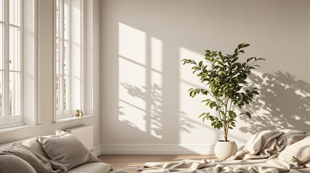
Earthy Neutral Options
Earthy neutral options, characterized by their warm tones and rich undertones, provide an inviting atmosphere in various home settings. These shades, ranging from soft beiges to deeper stone colors, not only enhance natural light but also pair seamlessly with diverse decor styles and materials. By exploring harmonious color combinations, homeowners can create cohesive and aesthetically pleasing spaces that reflect a timeless elegance.
Warm Earthy Neutrals
While selecting the perfect wall color can be a challenging task, warm earthy neutrals offer a versatile foundation for any space. Colors such as Oxford Stone by Farrow & Ball present a neutral beige with subtle earthy warmth, while Harvest Moon from Backdrop provides a comforting beige ideal for creating inviting atmospheres. Taos Taupe by Benjamin Moore is another classic choice, balancing organic tones without overwhelming heaviness. For a sophisticated touch, Jitney, also from Farrow & Ball, features muted taupe with gray undertones. Additionally, Maritime White from Benjamin Moore introduces creamy warmth, contributing to a natural ambiance. These options exemplify how warm earthy neutrals can enhance a room's character, making them suitable for various design styles and preferences.
Stone Collection Shades
The Stone Collection Shades represent a refined selection of earthy neutrals that seamlessly blend elegance with versatility. This collection includes Portland Stone, Portland Stone Pale, and Portland Stone Dark, each mirroring the original Portland Stone used on Victorian townhouses. These shades feature a highly-pigmented formulation with virtually zero VOCs, making them suitable for walls, panelling, and woodwork. Additionally, the Travertine shade offers natural, timeless colors that evoke comfort and serenity, ideal for both interior and exterior applications. Baluster, inspired by the carved balustrade at Penrhyn Castle, presents an authentic grey limestone color that harmonizes well with metalwork and slate. Each shade in the Stone Collection provides distinct tonal depth, enhancing the overall visual appeal of any space.
Harmonious Color Combinations
When selecting wall colors, harmonious combinations can elevate the atmosphere of a space, particularly when utilizing earthy neutrals. Neutral base colors such as gray, beige, and white provide versatility and create a calming effect. For example, beige walls paired with wood tones produce a warm environment, while gray walls complemented by earthy accents foster a balanced aesthetic. Utilizing the 60-30-10 rule can further enhance these combinations, ensuring that a dominant color, such as a neutral, occupies 60% of the space. Meanwhile, incorporating analogous colors can create a cohesive look, while balancing warm and cool hues prevents visual discord. Ultimately, thoughtful combinations of earthy neutrals can lead to sophisticated, timeless interiors that resonate with comfort and style.
Gray and Charcoal Choices
Gray and charcoal wall colors offer an array of elegant options that can enhance various interior design styles. These shades are particularly versatile due to their undertones; cool grays can balance warm accents, while warmer grays create a cozy atmosphere in any space. By understanding how to effectively pair these colors with different materials and lighting conditions, one can achieve a sophisticated and timeless look.
Elegant Dark Charcoals
Elegant dark charcoals, particularly in varying shades of gray, bring a sophisticated depth to interior design that is both inviting and dramatic. These hues foster an atmosphere of intimacy and moody drama, effectively obscuring room edges to create an illusion of spaciousness. Ideal for well-lit spaces, charcoal gray can serve as a bold focal point or a timeless exterior accent. It pairs seamlessly with cool tones like blues and whites, while contrasting effectively with warmer shades such as pinks and yellows. This color scheme enhances room cohesiveness, especially when combined with light wood or metallic accents. Proper lighting management is essential to guarantee that dark gray enriches a space without overwhelming it, making it a versatile choice for various design styles.
Versatile Gray Undertones
The allure of Versatile Gray lies in its mid-tone sophistication, making it an adaptable choice for various design contexts. This color, classified as SW 6072, features subtle red or pink-purple undertones, which can influence its appearance, causing it to look more gray or taupe depending on the lighting. With a Light Reflectance Value (LRV) of 48, Versatile Gray balances reflectance, enhancing both interior and exterior spaces. It pairs seamlessly with a range of colors, including crisp white and deep navy blue, allowing for both monochromatic and complementary schemes. To guarantee ideal integration into a space, it is essential to test samples under varying lighting conditions, as this can greatly alter its perceived hue.
Testing Your Paint Selections
How can you guarantee that your chosen wall colors will stand the test of time and harmonize with your space? Begin by obtaining paint samples and applying them in various areas of your walls to observe their appearance under different lighting conditions. Evaluate the colors in both natural and artificial light, noting changes throughout the day. It is essential to compare the original hue with any adjusted shades, as altering intensity can affect undertones and overall aesthetics. Additionally, assess how the color interacts with existing furnishings and decor. Finally, document your observations to make an informed decision, ensuring that the selected colors will remain appealing and versatile as your space evolves over time.
Color Combinations for Harmony
While selecting wall colors, achieving harmony through thoughtful color combinations is essential for creating a cohesive and inviting space. Utilizing analogous color schemes, which consist of three colors positioned side by side on the color wheel, fosters smooth shifts and a unified look. In contrast, complementary color schemes, featuring colors opposite each other, provide striking contrast and elevate visual interest. Additionally, drawing inspiration from nature can yield harmonious designs, incorporating earthy tones that evoke calmness and a sense of connection to the environment. Timeless neutrals, such as whites, grays, and soft blues, serve as versatile backdrops, adapting well to various decor styles. By thoughtfully selecting color combinations, one can achieve a balanced and harmonious atmosphere.
Lighting Considerations for Paint
Achieving harmony in wall colors extends beyond mere combinations; it encompasses the impact of lighting on paint selection. Natural light varies by direction, with southern exposures intensifying colors, while northern light softens them. Seasonal changes also affect color perception, as light quality fluctuates throughout the year. Artificial lighting plays a vital role, where warmer bulbs (below 3000K) enhance reds and yellows, while cooler bulbs can introduce bluish tones. The Color Rendering Index (CRI) is important for accurate color representation, influencing how hues appear in different fixtures. Testing paint under diverse lighting conditions, through swatches or drywall samples, allows for an all-encompassing understanding of color dynamics. Consequently, careful consideration of lighting guarantees a timeless and harmonious palette in any space.
Long-Lasting Trends in Color
As design preferences evolve, certain colors remain steadfast, embodying a sense of timelessness that transcends fleeting trends. Timeless neutrals, such as Chantilly Lace and Simply White, offer versatility and a clean aesthetic that complements various styles. Enduring blues, like Hale Navy and Kittiwake, provide calming atmospheres while maintaining a classic appeal. Lasting grays, including Quiet Grey and Classic Gray, adapt to light, enhancing depth in spaces. In addition, classic earth tones, such as Book Room Green and Sage Green, introduce natural elements that resonate with tranquility. These color selections not only withstand the test of time but also integrate seamlessly into both contemporary and traditional homes, ensuring that they remain relevant regardless of changing design fads.