

Define your space with color combinations that reflect your personality and elevate your environment. Begin with classic pairs such as black and white, achieving a stark contrast, or blue and orange, which combine warm and cool hues.
For areas requiring a dynamic aesthetic, consider triadic combinations like red, yellow, and blue, providing balance and vibrancy. Incorporate unique mixes such as Cherry Tomato and Rapture Rose to add energy to your design.
Utilizing four-color combinations can further enhance the space, meeting modern living standards. Learn how these color schemes can transform your environment.
Understanding Color Theory

To effectively utilize color in design, one must grasp the principles of color theory. This theory serves as a critical framework for achieving visual harmony through color application. The foundation rests on primary colors: red, blue, and yellow, from which all other colors originate. These primary colors blend to form secondary colors: orange, green, and purple.
The relationships among these colors play a crucial role in design. For example, complementary colors, positioned opposite each other on the color wheel, such as red and green or blue and orange, produce vibrant effects when combined. Colors can also convey varied psychological impacts; reds, yellows, and oranges can suggest warmth or discomfort, while blues, greens, and purples may evoke tranquility.
Further exploration of the RGB color wheel reveals deeper insights into hue, tint, shade, tone, and saturation, all essential for precise color manipulation to achieve specific design outcomes. Mastery of color theory is vital, whether for interior design, digital interfaces, or artistic compositions, ensuring effective and impactful color use.
Popular Two-Color Combos
Exploring popular two-color combinations enhances design projects, focusing on aesthetic and communication effectiveness. This discussion includes several impactful pairings.
Black and White, known for stark contrast, balances strength and tranquility, appealing for its modern, timeless look. This combination suits mid-century modern designs well.
Blue and Orange, a mix of cool and warm hues, captures attention and fosters trust alongside excitement. It's effective in marketing materials and interior decor, offering a striking visual statement.
Sailor Blue and Mint provide a contemporary, refreshing aspect to any area, particularly in achieving a chic aesthetic.
Gray paired with Lime Punch combines a neutral with a vibrant green, infusing personality and vitality. This pairing is popular in kitchen designs and automotive colors, reflecting a playful yet sophisticated style.
Cherry Tomato and Rapture Rose, combining red and pink, create vibrant, standout designs that break conventional color norms.
These color combinations serve various design needs, from enhancing visual appeal to conveying specific themes or emotions effectively.
Three-Color Matching Techniques
Exploring three-color matching techniques, triadic harmony is crucial. This method involves selecting three colors spaced evenly on the color wheel to create a vibrant, balanced design.
Another effective approach is the analogous color scheme, which uses adjacent colors on the wheel to achieve a unified, subtle appearance.
Triadic Harmony Essentials
Triadic harmony involves selecting three colors spaced evenly on the color wheel. This method ensures a balanced and visually pleasing blend.
Common triadic combinations include red, yellow, and blue or green, orange, and purple. These choices add depth and maintain cohesion in design projects.
For those planning to enhance a space, triadic harmony provides a vibrant yet balanced aesthetic. This color strategy makes environments distinct and visually engaging.
Analogous Scheme Insights
Analogous color schemes incorporate three adjacent colors on the color wheel, typically comprising one primary and two secondary hues. These schemes are effective in various design contexts, from interior decoration to logo creation, due to their ability to maintain visual interest without overpowering. The proximity of these colors on the wheel ensures a natural harmony, making them suitable for projects aiming for a visually cohesive outcome.
In design, analogous color schemes support a unified appearance. When decorating a room or developing brand visuals, these schemes allow for a blend of similar colors that enhance each other without creating contrast. This strategy ensures that designs remain engaging and dynamic, preventing a monotonous visual experience.
Applying this color strategy can significantly enhance the aesthetic coherence of a space or brand. It's especially beneficial in environments where a calm, yet attractive ambiance is desired. By carefully selecting and implementing these color schemes, designers can achieve an effective balance of unity and interest in their projects.
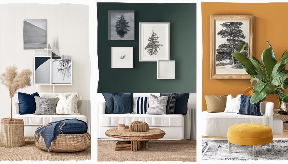
Four-Color Synergy
Four-color synergy effectively combines specific hues to enhance visual appeal and create balance in interior design. Selecting appropriate colors is crucial when modernizing a space. This method utilizes a palette that includes contrasting and harmonious shades, transforming any area into a dynamic and inviting environment.
Consider a palette incorporating deep blues, soft grays, vibrant yellows, and subtle greens. Each color contributes equally, ensuring balance without dominance. This strategy introduces complexity into decor, enhancing the room's cohesive atmosphere. Incorporating four-color synergy in furniture, wall paint, and accent pieces does more than decorate; it crafts an environment where colors complement each other for a unified, aesthetically pleasing look.
This approach aligns with modern living, allowing personal style to resonate through a thoughtfully chosen color scheme.
The Impact of Color Psychology

Color psychology reveals that specific hues influence emotions and behaviors. For example, blue can calm the mind, whereas red might energize a space. Utilizing color psychology effectively in various settings can enhance daily experiences. Select colors based on the desired mood; for instance, beige offers a peaceful backdrop, allowing bolder colors to stand out.
Incorporating strategic color use in room design impacts mood and behavior. Many businesses use this approach to influence consumer behavior. Applying these principles at home can alter the feel and functionality of spaces, whether seeking tranquility or vibrancy.
Designing With Color Trends
To leverage current color trends effectively in transforming your space, it's essential to stay informed about the latest preferences in design. Proper color selection transcends personal taste, focusing instead on prevailing trends that confer a modern and refined ambiance.
A prevailing trend involves the adoption of natural tones, which instill a sense of calm and connection to the natural world, thus grounding and soothing any interior. The integration of blue as an accent color introduces depth and energy, providing a striking contrast that revitalizes the environment.
Implementing a monochromatic color palette with these trending hues enhances sophistication. Utilizing varied intensities of a single color achieves a unified and balanced appearance, which aligns with contemporary style preferences.
Incorporating these strategies not only modernizes spaces but also aligns them with current aesthetic standards in interior design, ensuring both relevance and elegance.
Creating Your Color Palette
To develop a personalized color palette, begin by identifying colors you prefer consistently.
Observe how these colors influence the ambiance of various rooms.
It's essential to consider room lighting, as it significantly impacts the appearance of colors in an environment.
Identify Personal Color Preferences
Begin by identifying colors that you're naturally attracted to, as these colors are indicative of your personal preferences and emotions.
Incorporate shades from both warm and cool spectrums to craft a comfortable and stylish atmosphere.
Assess which color family aligns with your preferences. Consider whether the colors you select are more commonly found in natural settings or are predominantly vibrant and artificial.
Experiment by combining these colors to observe their interaction.
It's important to note that your choice of colors, along with significant experiences and preferred environments, significantly influences your unique color palette.
This process not only improves the aesthetics of your space but also enhances mood and productivity.
Analyzing Room Lighting Effects
Selecting colors for room interiors requires consideration of both natural and artificial lighting.
Natural light enhances the vibrancy and warmth of colors, making them more pronounced during daylight hours.
Artificial light, on the other hand, can significantly alter color perception and the mood of a room.
It's crucial to evaluate the effects of these lighting sources on color choices to ensure the desired impact is achieved consistently, regardless of the time.
By understanding the interaction between light and color, one can effectively optimize a room's ambiance and maintain the integrity of chosen hues.
This approach helps in creating a space that not only reflects personal style but also functions optimally under varying lighting conditions.
Practical Color Application Tips
Creating an accent wall effectively transforms a simple room into a captivating space with minimal effort. In the living room, select a deep, rich base color like midnight blue to create a focal point that enhances natural lighting. For the dining room, a splash of lime green adds vibrancy, stimulating both meals and social interactions.
To ensure color harmony in your home, adhere to the 60/30/10 color rule: 60% of the room should feature the dominant color, 30% a secondary color, and 10% an accent color. This strategy promotes balance and visual interest, ensuring no single color dominates.
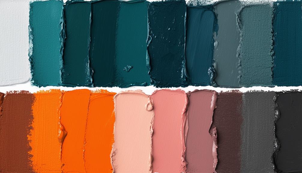
When choosing colors, verify their hex codes for accuracy. This precision in color selection supports consistent results in home décor. Using specific strategies and color percentages, you can enhance the aesthetic coherence of your living spaces.