
The decision to use darker or lighter furniture compared to wall colors critically shapes a room's design and atmosphere. Darker furniture against lighter walls creates a striking contrast, enhancing elegance and depth perception while keeping spaces visually open. On the other hand, lighter furniture against darker walls promotes a sense of spaciousness and airiness, highlighting furniture details. Successful design often follows the 60-30-10 rule for color distribution, ensuring balance. Ultimately, how these elements interact with natural light can further emphasize or diminish the overall aesthetic, allowing for sophisticated decor choices that suit individual preferences and room requirements. Exploring these dynamics can yield additional insights.
Importance of Color Matching
While selecting furniture, the importance of color matching cannot be overstated, as it greatly influences the overall aesthetic and ambiance of a room. Establishing a cohesive color palette begins with defining the main concept and tone of the space. A central color should be chosen to dominate the room, complemented by secondary and accent colors, adhering to the 60-30-10 rule for effective distribution. Ensuring color harmony involves selecting complementary shades that balance warm and cool tones, while neutral colors can provide flexibility. Practical considerations, such as existing colors and lighting, also play a significant role in color matching. Ultimately, achieving a well-coordinated color scheme enhances the room's function, style, and desired mood, creating a visually appealing environment.
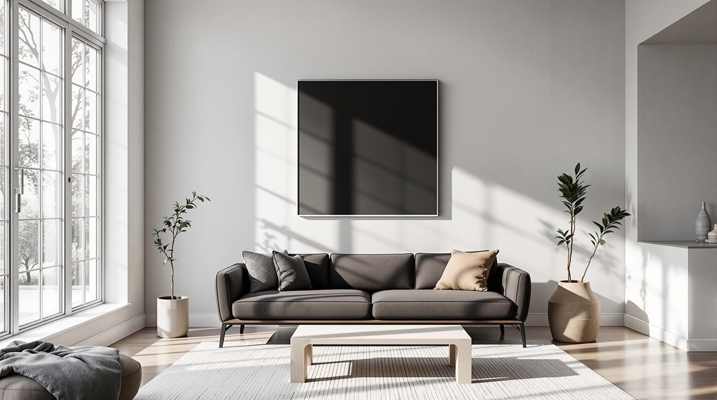
Darker Furniture With Lighter Walls
The combination of darker furniture with lighter walls creates a striking visual contrast that enhances the overall aesthetic of a space. This contrast not only establishes a balanced elegance but also allows for the integration of various design elements without overwhelming the room. Additionally, the interplay between these colors can elevate the perception of depth and dimension, contributing to a sophisticated ambiance that appeals to diverse design preferences.
Striking Visual Contrast
Striking visual contrast is achieved when darker furniture is paired with lighter walls, creating a dynamic interplay that draws attention and enhances a room's depth. This combination not only defines the space but also guides the eye towards key elements, allowing darker furniture to serve as a focal point that adds character and drama. Lighter walls reflect more light, making the room appear larger and brighter, while the darker furniture offers a grounding effect, preventing the space from feeling too airy. In addition, this arrangement allows for design flexibility, enabling easy updates to decor without clashing. Overall, the contrast fosters harmony and balance, contributing to a visually enchanting environment that enhances the overall aesthetics of the room.
Balanced Elegance and Style
Combining darker furniture with lighter walls not only enhances visual appeal but also establishes a balanced elegance that can transform any space. This approach creates a cohesive look, particularly in larger or well-lit areas, where lighter walls reflect light, making rooms feel more spacious. Darker furniture serves as a focal point, adding depth without overwhelming the surroundings. Additionally, darker pieces are practical for homes with children or pets due to their stain-resistant properties. This combination promotes a sense of airiness, while maintaining a harmonious balance. The contrast enhances sophistication and can evoke a calming atmosphere. Incorporating light-colored accessories further amplifies brightness, allowing for versatility in design while maintaining a unified aesthetic throughout the room.
Lighter Furniture With Darker Walls
Incorporating lighter furniture against darker walls can greatly enhance the perception of spaciousness and airiness within a room. This contrast not only highlights the features of the furniture but also serves to balance the more intense aesthetics of the darker hues, creating a visually appealing environment. By carefully selecting light-colored pieces, homeowners can achieve a harmonious blend that emphasizes elegance while maintaining a sense of openness.
Enhancing Spaciousness and Airiness
A well-chosen palette of lighter furniture against darker walls can greatly enhance the perception of spaciousness and airiness in a room. Light-colored furniture, such as neutral gray or beige, offsets dark walls, creating a balanced aesthetic that feels expansive. This contrast draws attention to the furniture, allowing it to serve as a focal point rather than the walls. Additionally, incorporating ample natural light through larger windows or mirrors helps maintain an open atmosphere, counteracting any potential enclosure from dark hues. In smaller spaces, light furniture can blur the lines of the background, further enhancing the illusion of size. Ultimately, this design strategy fosters an inviting environment while preventing the space from feeling cramped or overwhelming.
Highlighting Furniture Features
Creating a striking visual dynamic in interior design can be achieved through the use of lighter furniture against darker walls. This combination fosters a compelling contrast, allowing lighter pieces to stand out as focal points within the room. The depth and dimension introduced by this contrast can enhance the overall aesthetic, especially when bold, deep colors are employed on walls. Selecting shades like white, cream, or light gray guarantees a harmonious balance, particularly in spaces with ample natural light, which softens the darker tones. Additionally, incorporating metallic accents and light-colored accessories can further elevate the ambiance, creating a cozy yet sophisticated atmosphere. To maintain brightness, consider using light area rugs and secure adequate lighting throughout the space.
Balancing Darker Aesthetics
While darker walls can impart a sense of drama and sophistication to a room, balancing them with lighter furniture is crucial for achieving an aesthetically pleasing environment. The contrast created by lighter furniture prevents the space from feeling overly dark or heavy, providing visual interest. Neutral shades such as gray, beige, or white can enhance this balance, while metallic accents add brightness. In smaller rooms, lighter furniture helps maintain the illusion of space, countering the potential claustrophobia of dark walls. Additionally, a harmonious color scheme guarantees that no single element dominates the design. This combination not only enhances ambiance but also fosters functionality, making spaces feel inviting and cohesive for both relaxation and socialization.
Creating a Cohesive Look
To achieve a cohesive look in a space, it is essential to harmonize the colors of walls and furniture effectively. Utilizing the color wheel can guide you in selecting complementary or analogous colors, enhancing color harmony. Additionally, evaluating undertones—whether warm or cool—ensures a successful match between furniture and wall colors. For a seamless appearance, consider painting both walls and furniture in the same hue, which can create the illusion of a larger space. Employing the 60-30-10 rule aids in achieving balance, as it dictates color distribution throughout the room. Finally, selecting furniture as a design anchor can streamline the process, ensuring coherence and unity in the overall aesthetic. This analytical approach fosters a well-coordinated interior environment.
Enhancing Visual Interest
A cohesive color palette establishes a strong foundation for any interior design, yet enhancing visual interest is key to creating an engaging and dynamic space. Utilizing monochromatic schemes allows for variation in texture and pattern, with elements like velvet and suede adding depth. Strategic color placement, such as painting storage furniture to mimic wall color, can create the illusion of built-ins while minimizing visual clutter. Introducing contrasting accent colors or unexpected touches on ceilings enhances intrigue, drawing attention to specific areas. Architectural and decorative elements painted in the same color as walls can either blend in or stand out, allowing other features like rugs and artwork to take precedence, thereby enriching the overall visual experience.
Balancing Space and Light
Achieving balance between space and light is essential for creating an inviting and harmonious interior. Matching furniture colors with wall colors can unify a room, making it feel larger by minimizing visual contrasts. Conversely, contrasting furniture with wall colors adds depth and visual interest; for instance, darker furniture on lighter walls provides a striking look, while lighter pieces against darker walls create an airy atmosphere. Employing the 60-30-10 rule helps maintain a balanced color scheme, ensuring no color dominates excessively. Additionally, considering natural light is important, as it can alter color perception and ambiance. Maximizing natural light enhances overall balance, making informed choices about furniture and wall colors critical for spatial harmony.
Color Harmony in Furniture Choice
Creating an inviting interior involves careful consideration of color harmony in furniture choice. The relationship between wall and furniture colors greatly impacts the overall aesthetic. For instance, lighter walls paired with darker furniture create a fascinating contrast that enhances both elements, preventing the room from appearing overly dark. Conversely, darker walls necessitate lighter furniture to offset their intensity, promoting a sense of brightness and spatial expansion. Neutral backgrounds, such as beige or gray, offer versatility, allowing for seamless integration with various furniture colors. Harmonious color combinations, particularly those using pastels or colors from the same shade family, foster a serene atmosphere. Ultimately, achieving color harmony involves a thoughtful balance that reflects personal style while enhancing the room's functionality.
Texture and Pattern Considerations
Texture and pattern play essential roles in defining the character of a space, contributing depth and visual interest that complement color choices. Starting with a neutral base allows for a versatile foundation, enabling the incorporation of patterns in varying scales to achieve balance. Combining diverse textures, such as velvet and leather, enhances the tactile experience while maintaining visual intrigue. Solid intermediaries, like throw pillows, can effectively break up competing patterns. Strategic placement of textures and patterns draws attention to key features, while contrasting surfaces emphasize each texture's impact. It is vital to maintain a cohesive look by limiting the number of textures and ensuring patterns harmonize through consistent color schemes, ultimately fostering a visually balanced environment.
Avoiding Monochromatic Overwhelm
While a monochromatic color scheme can create a serene and cohesive look, it risks becoming visually overwhelming if not carefully balanced. To achieve harmony, allocate approximately 60% of the space to a dominant color, typically on walls or cabinets. Secondary colors should occupy 30% of the area, mainly through furniture or decorative elements, while only 10% should be reserved for accent colors. Using the color wheel can help identify complementary or analogous colors that enhance the visual appeal. Additionally, consider furniture undertones; neutral pieces allow for bold wall colors, while vibrant furniture may necessitate subdued walls. Incorporating patterned accents can bridge the gap between wall and furniture colors, ensuring a well-rounded aesthetic that avoids monotony.