

For sophisticated interior design, selecting the appropriate color palette is essential. Start with a foundation of neutral colors including white, beige, gray, and taupe. These neutrals provide versatility and an understated elegance.
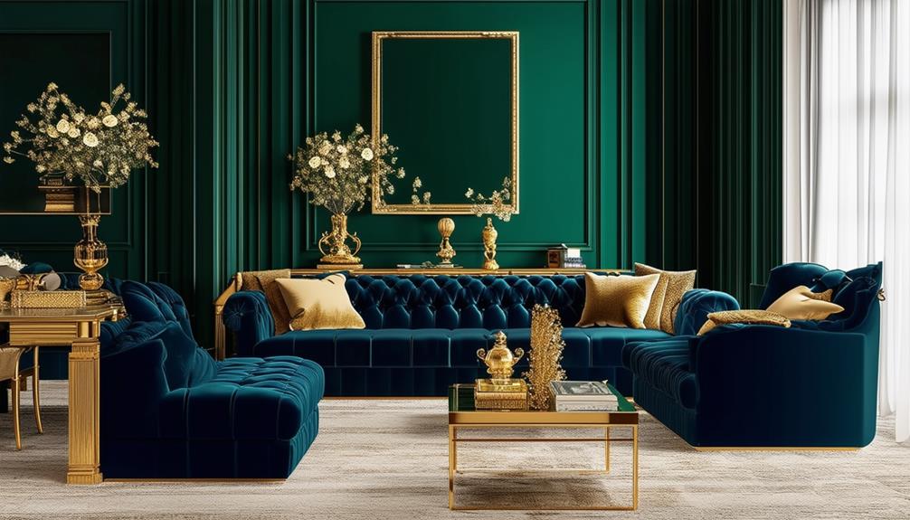
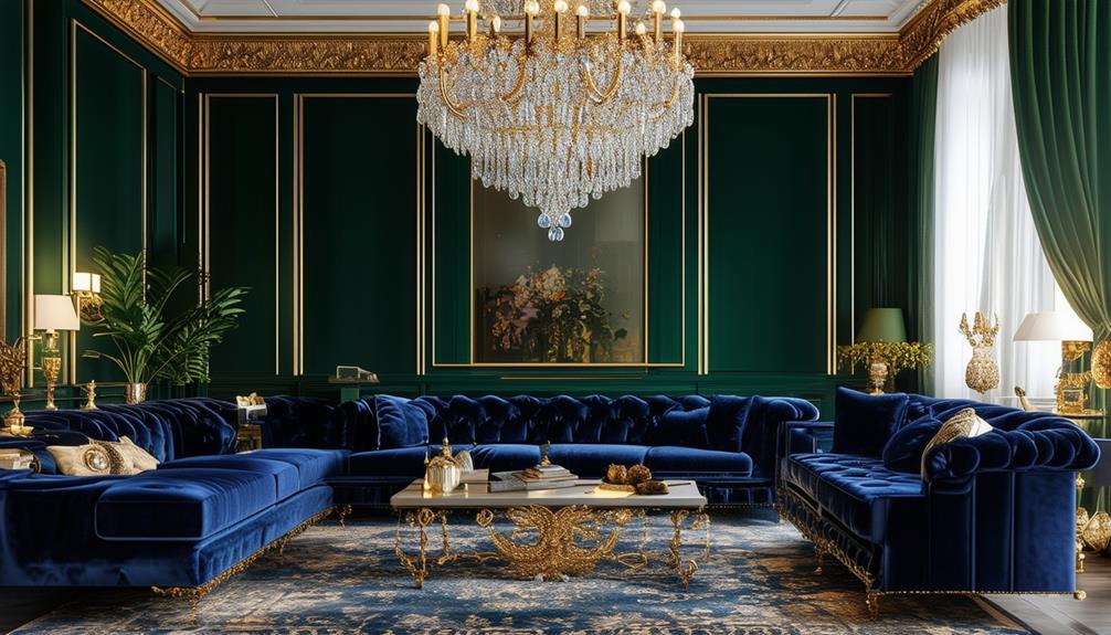
Introduce deep blue shades complemented by metallic tones to enhance vibrancy and maintain balance. The influence of lighting on these colors significantly affects both perception and the atmosphere within the space.
Tailoring color choices to individual preferences not only showcases personal style but also improves the overall ambiance, rendering the space distinctively attractive. Continuing to refine and diversify color integration can elevate the aesthetic of any interior.
Defining Sophistication in Color
Sophistication in color involves selecting neutral and muted tones, which not only appeal to a broad audience but also add elegance to spaces such as homes or offices. The choice of color significantly influences the overall atmosphere. It involves selecting hues that not only personally resonate but also elevate the environment's sophistication.
Incorporating neutral tones in the color palette ensures the space remains adaptable and appealing to various preferences. These hues act as a refined backdrop, facilitating the integration of diverse textures or accent pieces without overstimulating. Muted shades, on the other hand, contribute subtlety to the refinement and perception of luxury in the space without dominating it.
Maintaining color consistency across different rooms or areas achieves a cohesive and harmonious appearance. While not every room requires the same color, ensuring that colors complement each other supports a consistent theme throughout. This strategic color application advances the overall elegance of the design, allowing each element in the room to contribute to a unified and sophisticated aesthetic.
Essential Neutral Color Schemes
Exploring essential neutral color schemes in interior design reveals their enduring appeal. White, beige, gray, and taupe shades function as a versatile and sophisticated foundation, compatible with various decor styles. These neutral tones contribute to a calm, elegant, and luxurious atmosphere in interiors.
Neutral color schemes offer versatility in coordinating with different textures and materials. For example, a soft velvet throw complements a sleek taupe sofa, while wooden accents enhance a creamy white setting. These elements introduce depth and maintain visual interest without overwhelming the senses.
The adaptability of neutral palettes facilitates interior updates. By changing accent pieces such as cushions, rugs, or artwork, one can personalize and rejuvenate a room without a complete redesign. This practicality makes neutral color schemes suitable for both timeless and contemporary interiors, ensuring the space remains fresh and refined.
Complementary Color Dynamics
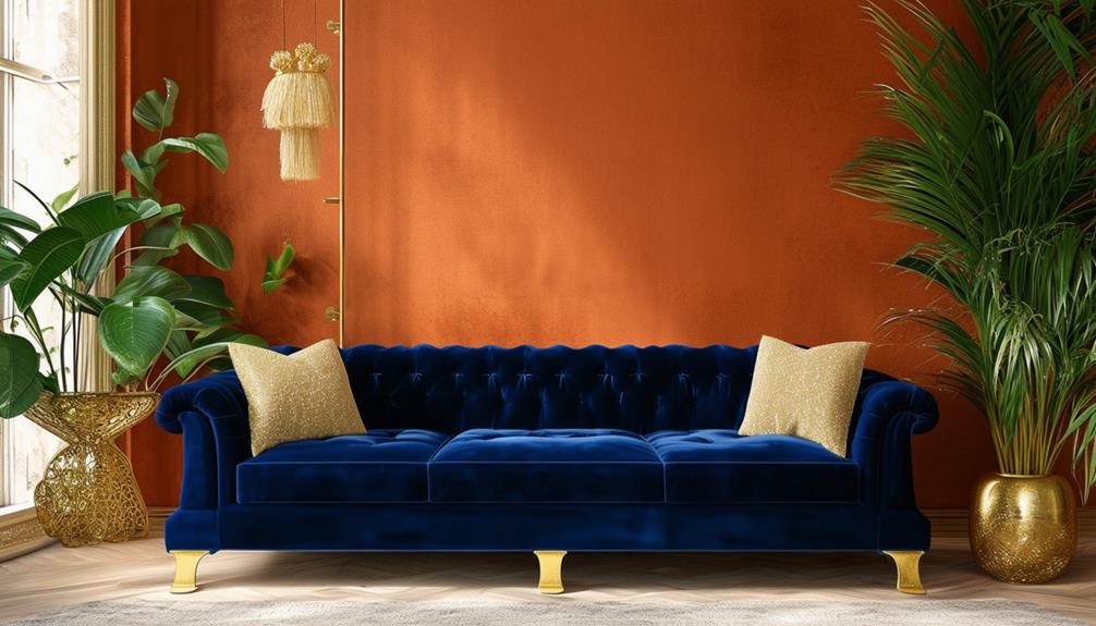
Explore the world of complementary colors in interior design to achieve both harmony and visual interest. Pairing colors opposite each other on the color wheel, such as blue and orange or red and green, enhances the qualities of each color. This design strategy not only balances the space but also injects vibrancy.
For example, a living room featuring deep blue and warm orange or a kitchen accented with green and red can transform the atmosphere of the room. These color combinations contribute to a visually appealing and sophisticated environment.
Proper use of complementary colors can elevate your home decor. The goal is to create an environment that's both energized and harmonious. By applying complementary colors strategically, your interiors can become more engaging and visually striking spaces.
Ensure to use specific colors from the color wheel and apply them in a balanced way to optimize the visual impact and harmony in your interior spaces.
Impact of Light on Colors
Exploring the impact of light sources on color perception is crucial in interior design.
Natural sunlight and artificial LED lighting each modify how colors appear, influencing the atmosphere of a space.
Sunlight tends to enhance warmth in colors, while LED lighting can create cooler tones.
Understanding these effects allows designers to strategically use light to add depth and achieve specific moods in various environments.
It's essential for designers to consider how light interacts with color to optimize the aesthetics of their projects effectively.
Enhancing Depth With Illumination
Lighting significantly affects color perception in interior spaces. Proper illumination enhances the vibrancy and depth of colors.
Natural light vividly enhances colors, while artificial lighting modifies color perception, emphasizing various hues and textures. This interaction contributes to a visually dynamic experience that adds sophistication to interiors.
Strategic lighting design highlights specific color combinations and introduces shadows and reflections, which add layers and dimension to the space.
Light Source Variability Effects
Understanding the effects of different light sources on color perception is crucial for optimizing the visual impact of interior spaces. Natural light enhances color vibrancy and clarity, while artificial light, depending on its temperature, can alter color tones significantly.
Direct sunlight may intensify colors, whereas dim artificial lighting often subdues them. Positioning light sources strategically is vital to achieve consistent color balance and maintain the intended visual and emotional effects under varying lighting conditions. This approach ensures that interior colors remain true to their design regardless of light source variations.
Textural Influences on Hues
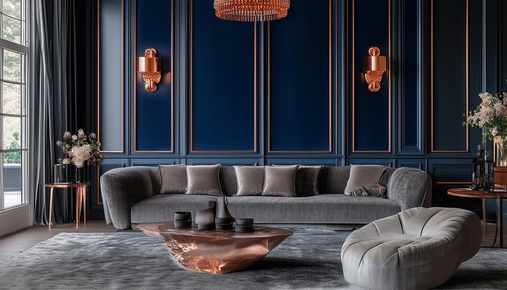
In interior design, the selection of fabrics such as velvet or silk significantly influences the associated color perceptions. Textiles with intricate weaving patterns often modify how colors are perceived, potentially enhancing vibrancy or depth.
Textures like plush can amplify color dynamics, contributing sophistication and depth to design schemes. This effect of textures on color perception is well-documented in design studies, emphasizing the importance of material choice in achieving desired aesthetic outcomes.
Fabric Impact on Color
The texture of a fabric significantly affects the perception of its color in an interior setting. Velvet, a luxurious fabric, intensifies colors, adding depth to spaces, as seen in velvet sofas which appear more vibrant compared to those in flatter fabrics.
Linen, in contrast, tends to mute colors, contributing to a casual and sophisticated atmosphere. Silk, known for its fine texture, enhances the luminosity and vibrancy of colors, making it suitable for high-end interior designs.
Weaving Patterns and Tones
Exploring weaving patterns and tones demonstrates the impact of textures on color perception in interior design. Textures such as velvet and silk enhance color depth, unlike flat paints.
Patterns, including geometric or floral, modify light and shadow, increasing color vibrancy.
Combining different textures, for example, smooth leather with rough wool, enriches both tactile and visual experiences.
Metallic accents, such as gold throws or silver mirror frames, add sophistication to the space.
Effective interior design balances these elements to create a visually appealing environment.
Plush Textures' Color Dynamics
Velvet and silk fabrics increase the depth and richness of interior colors, enhancing the space's luxurious appearance. These materials, when incorporated into home design, not only add visual interest but also elevate the sophistication of the color scheme.
Velvet curtains and plush rugs serve functional roles and improve the space's aesthetic by interacting with light and color. This interaction between plush textures and colors contributes to a refined and inviting ambiance. Incorporating these textural elements transforms a space into a sophisticated interior environment.
Creating Lasting Impressions
Choosing appropriate color palettes significantly enhances the appeal of a home, ensuring a sophisticated and luxurious environment. Opting for the right colors means creating more than mere aesthetics; it involves making strategic decisions that define the space's character and functionality. This approach not only elevates the design but also personalizes each room, reflecting individual styles and preferences.
Specific color combinations, such as deep blues with metallic accents or soft pastels paired with rich creams, play a crucial role in transforming spaces into visually appealing areas. These schemes aren't arbitrary but are chosen to resonate with the inhabitants and visitors alike, providing each room with its distinct identity.
Integration of colors based on personal taste and style adds a unique dimension to the home's interior. This method ensures that each space not only looks aesthetically pleasing but also embodies a sense of luxury and sophistication. The impact of these carefully selected palettes is evident in the enhanced ambiance of the home, which appeals to all who enter.