
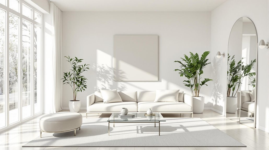
To create the illusion of a larger room, it is essential to choose light-colored furniture. Shades such as white, light gray, and other neutrals reflect more light, enhancing brightness and space perception. Cool colors like blue and green also contribute to a sense of depth, as they visually recede. In contrast, darker hues absorb light, making a room feel smaller. Additionally, incorporating furniture with exposed legs can enhance airflow and light circulation. When combined with light-colored walls and floors, this selection promotes an expansive atmosphere. Further insights can enrich your understanding of optimizing space aesthetics.
Impact of Color on Space
How does color influence our perception of space? Color choice greatly affects how we perceive room dimensions. Warm colors, such as red and orange, evoke comfort but can make spaces feel smaller. In contrast, cool colors like blue and green tend to recede visually, contributing to a sense of spaciousness. Light and neutral shades, such as white and beige, enhance this effect, making walls appear to recede. Conversely, darker hues absorb light, creating a cozier yet smaller atmosphere. Additionally, pastel tones can promote serenity and enhance the perception of space. The saturation of colors also plays a role; lighter pastels tend to feel more expansive, while deeper tones can impart intimacy, illustrating the intricate relationship between color and spatial perception.
Light Reflection and Room Size
While the choice of color markedly impacts a room's perceived dimensions, the interplay between light reflection and color plays an essential role in enhancing or constraining spatial perception. Lighter colors, particularly those with a higher Light Reflectance Value (LRV), reflect more light, thereby creating an illusion of spaciousness. Cool colors, with their shorter wavelengths, scatter light and visually expand the area. Conversely, warm colors can visually advance, making a space feel smaller. Additionally, light-colored furniture further contributes to an airy atmosphere, particularly when paired with light wall hues. Incorporating reflective surfaces, such as mirrors and metallic accents, enhances this effect, as they amplify light and depth, ultimately giving the impression of a larger room.
Psychological Effects of Colors
The psychological effects of colors considerably influence human emotions and behaviors, shaping our experiences within a space. Warm colors, such as red, orange, and yellow, evoke feelings of warmth and comfort, but can also incite anger and hostility. In contrast, cool colors like blue and green promote calmness and concentration, beneficial for individuals experiencing stress or anxiety. Red can stimulate high energy and leadership qualities in work environments, although it may hinder performance on tasks requiring focus. Cultural perceptions further complicate these effects; for instance, while red symbolizes love in many cultures, it may also represent anger. Ultimately, understanding these psychological impacts is essential for creating environments that foster desired emotional responses and behaviors.
Choosing the Right Furniture Color
When selecting furniture colors, what considerations should guide your choices to enhance a room's spaciousness? Opting for light-colored furniture, such as white or light gray, can greatly reflect light, creating a brighter and more expansive atmosphere. These hues help prevent a claustrophobic feeling in smaller rooms, as they foster an open environment. It is essential to choose smaller, proportionate pieces that do not overwhelm the space, while placing them away from walls to enhance visual roominess. Additionally, furniture with exposed legs allows light and air to circulate, further contributing to the illusion of space. Combining light colors with reflective materials, like glass or polished metal, amplifies this effect, ensuring a cohesive and airy aesthetic.
Coordinating Floors and Walls
Achieving a harmonious balance between floors and walls is essential for creating an illusion of spaciousness in any room. Lighter color combinations for floors and walls evoke an open and airy feel, while contrasting tones can enhance depth. For instance, dark hardwood floors pair effectively with light neutrals, while light wood floors complement cooler whites. Additionally, understanding color undertones is vital; cool-toned woods work well with warmer wall colors and vice versa. In smaller spaces, uniform light tones can increase perceived size, while larger rooms benefit from a mix of light walls and darker floors to maintain warmth. Techniques like horizontal stripes can elongate walls, while soft pastels provide color without overwhelming the space, ensuring a cohesive and inviting atmosphere.