
The ideal color for wooden furniture is contingent upon the desired aesthetic. Warm tones, such as cherry and mahogany, introduce a sense of elegance, while cooler options like ash and maple provide a contemporary feel. Neutral shades, including walnut and oak, offer versatility and balance, serving as effective backdrops for contrasting colors. Seasonal trends favor dark, cozy hues in winter and calming blues in summer. Ultimately, the choice should align with overall interior design, taking into account the interaction of natural and artificial light. Exploring various options will yield insights into achieving harmony and visual cohesion in your space.
Importance of Color in Design
The significance of color in design transcends mere aesthetics, serving as a powerful tool for evoking emotions and communicating messages. Colors notably influence behavior, with warm tones like red and yellow generating feelings of happiness and energy, while cool hues such as blue and green promote calmness and relaxation. Furthermore, neutral colors provide crucial backdrops that enhance the visibility of brighter shades. Regarding communication, color acts as a universal language, greatly impacting consumer decisions, as nearly 90 percent of buying choices are influenced by visual factors. Effective design employs color to create contrast, draw attention, and establish harmony, making an understanding of color psychology essential for producing impactful and engaging work in both graphic and interior design contexts.
Popular Wood Furniture Colors
When selecting colors for wooden furniture, understanding the various undertones can greatly enhance both aesthetic appeal and functional harmony within a space. Popular wood colors can be categorized into warm, cool, and neutral undertones. Warm tones include cherry and mahogany, which offer rich reddish-brown hues, ideal for elegant settings. Cool-toned options like ash and maple provide a lighter, contemporary feel, with maple's straight grain being particularly durable. Neutral undertones such as walnut and oak balance light and dark, easily fitting into diverse design schemes. Current trends emphasize nostalgic browns and organic looks, showcasing textures and bleached finishes that highlight the wood's natural beauty. These selections cater to various preferences, allowing for personalized interior aesthetics.
Best Complementary Wall Colors
Choosing the right wall color to complement wooden furniture can greatly enhance the overall aesthetic of a room. Neutral colors, such as gray, beige, and cream, create a harmonious backdrop, allowing the warmth of wood to shine through. Gray, in particular, adapts well to both light and dark woods, while creamy tones enhance lighter varieties. Earthy colors, including olive greens and light blues, evoke tranquility and pair effectively with various wood types. For a bolder approach, dark blue or black walls provide striking contrasts, especially against light woods, adding sophistication. Ultimately, selecting complementary wall colors should align with the wood's tone and desired ambiance, ensuring a cohesive and visually appealing space.
Paint Colors for Wood Furniture
Selecting the right paint color for wooden furniture can considerably influence the overall atmosphere of a room, complementing the existing wall colors while also showcasing the furniture's natural beauty. Neutral shades, such as white and gray, offer timeless versatility, seamlessly blending with various wood types. Warm neutrals, like beige and taupe, create a cozy environment, enhancing the inviting nature of wooden pieces. For those seeking vibrancy, bold colors such as coral and dragon fruit can add a striking pop, while earthy tones like driftwood and greige maintain a grounded aesthetic. Darker hues, including black and dark green, impart sophistication, providing a dramatic contrast against lighter woods, ultimately enhancing the visual appeal of the furniture.
Aesthetic Impact of Wood Tones
The aesthetic impact of wood tones plays a significant role in defining the character and ambiance of a space, influencing how furniture interacts with the overall design scheme. Light wood tones, such as pine and birch, create an airy atmosphere, instilling feelings of optimism and clarity while making rooms feel more spacious. In contrast, medium wood tones like oak and cherry evoke stability and comfort, promoting a cozy environment conducive to relaxation and social interaction. Dark wood tones, including mahogany and ebony, impart a sense of luxury and sophistication, fostering intimacy and warmth. Understanding these aesthetic impacts allows for more informed choices in wood selections, enhancing the overall harmony and functionality of a given space.
Choosing Colors for Different Rooms
When selecting colors for different rooms, it is essential to contemplate the specific functions and atmospheres each space requires. In living rooms, neutral colors can create a tranquil environment, while warm hues add vibrancy and energy, especially in dining areas. Conversely, bedrooms benefit from warm and cool tones that promote relaxation, allowing for a harmonious blend with various wood finishes.
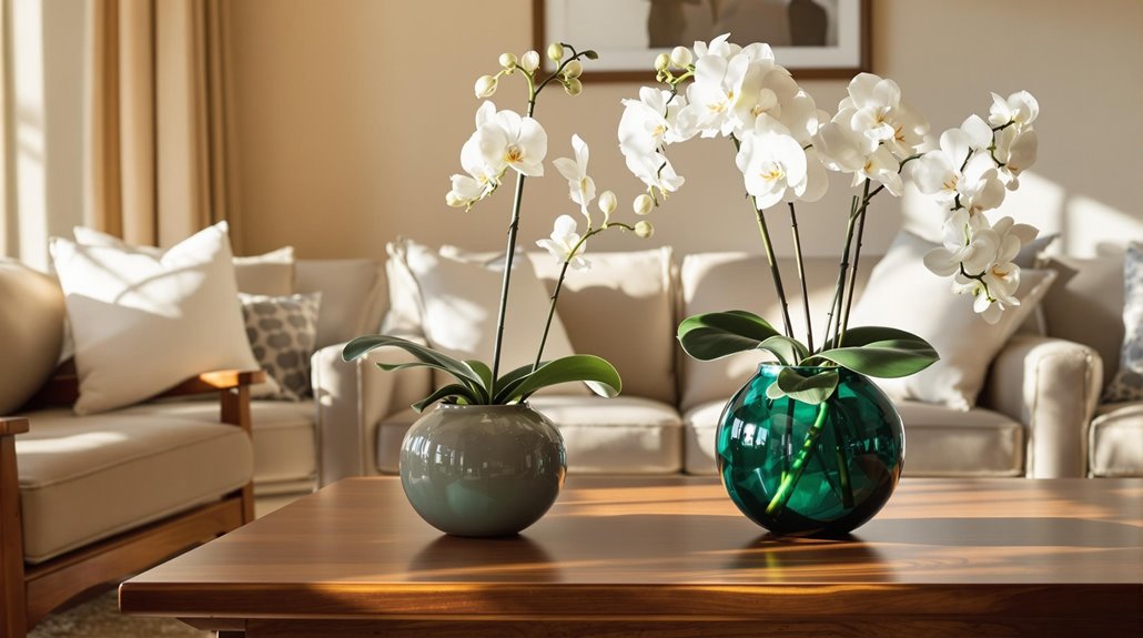
Living Room Selections
How can the choice of color transform the ambiance of your living room? The selection of colors greatly influences the space's overall mood and functionality. Earth tones, such as warm browns and soft greens, create a cozy and inviting atmosphere, while muted oranges can introduce visual interest without overwhelming the room. Neutral shades like beige and cream complement wooden furniture effectively, establishing a balanced aesthetic. For those seeking a more energetic environment, bold colors like reds and yellows can stimulate conversation and activity, particularly when used as accents. Additionally, cool tones such as light blues and greens promote calmness, pairing well with various wood finishes, thereby enhancing the living room's appeal while maintaining a cohesive design.
Bedroom Color Choices
Selecting the right color for a bedroom is essential, as it not only reflects personal style but also influences the overall atmosphere and comfort of the space. Calming colors such as soft blues and pale greens promote tranquility and a connection to nature, enhancing relaxation and reducing stress. Pastel pinks offer warmth and an inviting ambiance, fostering intimacy. Soft neutrals, including light grays and warm beiges, provide versatility and a serene backdrop for various decor styles. Light woods pair well with creams and soft greens, while cool-toned woods complement light grays. Ultimately, the choice of color should harmonize with the furniture's undertones, creating a cohesive and peaceful environment conducive to restful sleep.
Trends in Wood and Color
As we explore current trends in wood and color, it becomes evident that popular color pairings are evolving alongside seasonal preferences, reflecting broader design movements. The resurgence of dark wood tones, combined with warm neutrals, highlights a shift towards inviting atmospheres that emphasize timeless design choices. Understanding these trends will not only enhance aesthetic appeal but also inform personal preferences in wooden furniture selection.
Popular Color Pairings
A diverse array of color pairings can considerably enhance the aesthetic appeal of wooden furniture, reflecting current trends in design. Neutral tones such as gray, white, and beige complement various wood types, while warmer shades like greige and ivory harmonize with specific wood finishes. Earthy colors, including olive greens and tan, create a natural ambiance when paired with both light and dark woods. For a more vibrant look, light blue, orange, and turquoise can introduce energy without overwhelming the space. Additionally, pairing wood-specific colors with their respective wood types—creams with light woods and cool grays with dark woods—ensures a cohesive and refined appearance. These combinations not only elevate the furniture but also enhance the overall interior design.
Seasonal Color Trends
Understanding seasonal color trends is essential for creating furniture designs that resonate with current aesthetics and environmental moods. In fall and winter, dark, earthy colors like dark green and chocolate brown are favored for their ability to create cozy atmospheres, enhancing the natural beauty of wood. Notable choices include Benjamin Moore's Dark Olive and Little Greene's Ganache. Conversely, spring and summer trend towards calming blues and greens, such as Farrow & Ball's Cromarty, which evoke serenity and freshness. These colors can harmonize with various wood undertones; warm woods pair well with beige and gold, while cool woods complement neutral or bluish hues. This knowledge of seasonal trends guarantees that furniture remains stylish and relevant throughout the year.
Timeless Design Choices
While contemporary trends often shift, the essence of timeless design choices in wood and color remains steadfast, guaranteeing that furniture not only endures stylistically but also complements various interior aesthetics. Classic wood types such as cherry, walnut, and mahogany, with their rich hues and unique grain patterns, offer sophistication and warmth. The use of warm undertones in cherry and red oak creates a cozy ambiance, while the cool undertones of ash and maple evoke modernity. Neutral colors like white and gray harmonize with most wood shades, enhancing their natural beauty. Opting for medium-toned stains and avoiding trendy finishes guarantees that wooden furniture maintains its elegance, reflecting a commitment to enduring quality in design choices.
Tips for Harmonizing Colors
How can one achieve a harmonious color scheme when selecting hues for wooden furniture? Begin by choosing complementary colors, such as pairing light blue with wood for a calming effect or using shades of gray to create a contemporary vibe. Incorporate neutral tones like beige or white as they provide a tranquil backdrop that enhances wooden textures. Understanding color theory is essential; utilizing analogous colors fosters cohesiveness, while complementary colors introduce dynamic contrasts. When mixing wood tones, guarantee matching undertones and apply a light, medium, dark formula for depth. Additionally, balancing warm and cool colors with neutrals aids in smoothing shifts, while varied textures and patterns add visual interest,